Discover the common website mistakes that cost wineries reservations—and learn practical ways to turn more visitors into paying guest
Your website may be attracting visitors—but is it turning them into guests?
Many wineries invest heavily in beautiful photography, social media, email marketing, and paid advertising to drive traffic to their website. Yet despite healthy visitor numbers, online reservations often fall short of expectations.
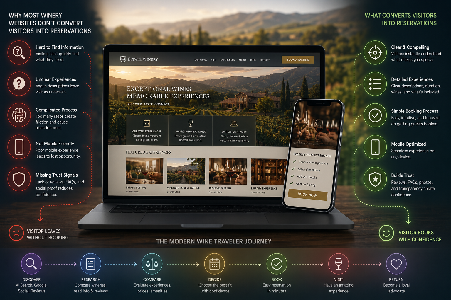
The problem usually isn't a lack of interest—it's friction.
Today's wine travelers expect a seamless experience from the moment they discover your winery to the moment they complete their reservation. Every unnecessary click, unanswered question, or confusing page increases the chance they'll move on to another winery.
Let's explore the most common reasons winery websites fail to convert visitors into reservations—and what you can do about it.
Research consistently shows that website visitors form an impression within seconds of landing on a page. If they can't quickly understand what makes your winery special, many won't stay long enough to book.
Your homepage should immediately answer four questions:
Those answers should be obvious without requiring visitors to scroll extensively or navigate multiple pages.
One of the most common usability issues is making the reservation process difficult to start.
Avoid hiding your booking button inside menus or placing it only at the bottom of a page. Instead, include a prominent Book a Tasting or Reserve Now button in your site's main navigation and repeat it throughout key pages.
Every page should make it easy for visitors to take the next step.
Photography creates emotion, but it rarely answers the practical questions that influence booking decisions.
Visitors also want to know:
The more complete your information, the more confident visitors feel about booking.
Too many winery websites scatter important details across multiple pages.
Hours on one page.
Pricing on another.
Policies hidden in FAQs.
Amenities buried in the footer.
Instead, organize your information so visitors can easily find everything they need before making a reservation.
Reducing uncertainty increases conversions.
Many reservation pages simply list:
That tells visitors very little.
Instead, describe each experience clearly.
For example:
Guests aren't booking a time slot—they're choosing an experience.
More than half of travel research now happens on mobile devices.
If your reservation process requires excessive zooming, scrolling, or typing, visitors may abandon it before completing their booking.
Review your website regularly on a smartphone to ensure every page is fast, readable, and easy to navigate.
Rarely is your winery the only one a traveler is considering.
Guests compare:
The easier you make those comparisons, the more likely visitors are to choose your winery with confidence.
For many travelers, reviews are the deciding factor.
Highlight authentic reviews that mention:
Fresh, genuine reviews help reassure first-time guests that they'll have a great experience.
Every unanswered question creates friction.
Consider adding a robust FAQ section covering topics such as:
These answers improve both customer confidence and visibility in AI-powered search.
Most visitors don't travel to wine country to visit a single winery.
They plan an entire day—or even an entire weekend.
Consider recommending:
Providing helpful planning information positions your winery as a trusted local resource rather than simply another reservation destination.
Slow websites lose reservations.
Large image files, unnecessary animations, and outdated code can all increase page load times.
Visitors expect pages to load almost instantly, especially on mobile networks.
Regularly monitor your site's performance and optimize images and scripts to keep the experience fast.
Being found online is only the beginning.
Modern websites should also support:
The richer and more complete your website, the more likely both search engines and AI platforms are to recommend your business.
Traffic alone doesn't tell the full story.
Track metrics such as:
These insights help identify where visitors lose confidence—and where small improvements can lead to more bookings.
A successful winery website does more than look beautiful—it answers questions, builds trust, reduces friction, and makes it easy for visitors to say "yes."
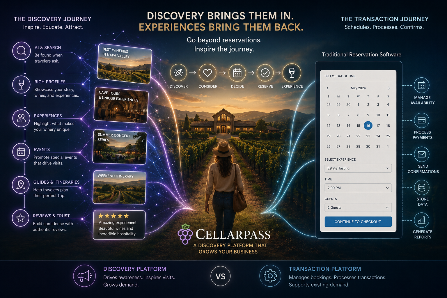
As travelers increasingly rely on AI assistants, review platforms, and rich business profiles to plan their wine country adventures, the wineries that provide the clearest, most complete, and most helpful information will stand out.
Your website shouldn't simply accept reservations. It should inspire confidence, showcase your hospitality, and guide guests effortlessly from discovery to booking.
At CellarPass, we believe the best winery websites do exactly that—combining rich storytelling, practical information, and a seamless reservation experience to help wineries attract more qualified visitors and convert them into loyal guests.